/ UA /
SOSO_BRAND
Філософія бренду: ідея відтворення величі та неповторності кожного виробу.
Кожен виріб є результатом творчого процесу, в якому кожен вузол, кожна петля, кожен шов -
це прояв уваги та турботи про клієнта.
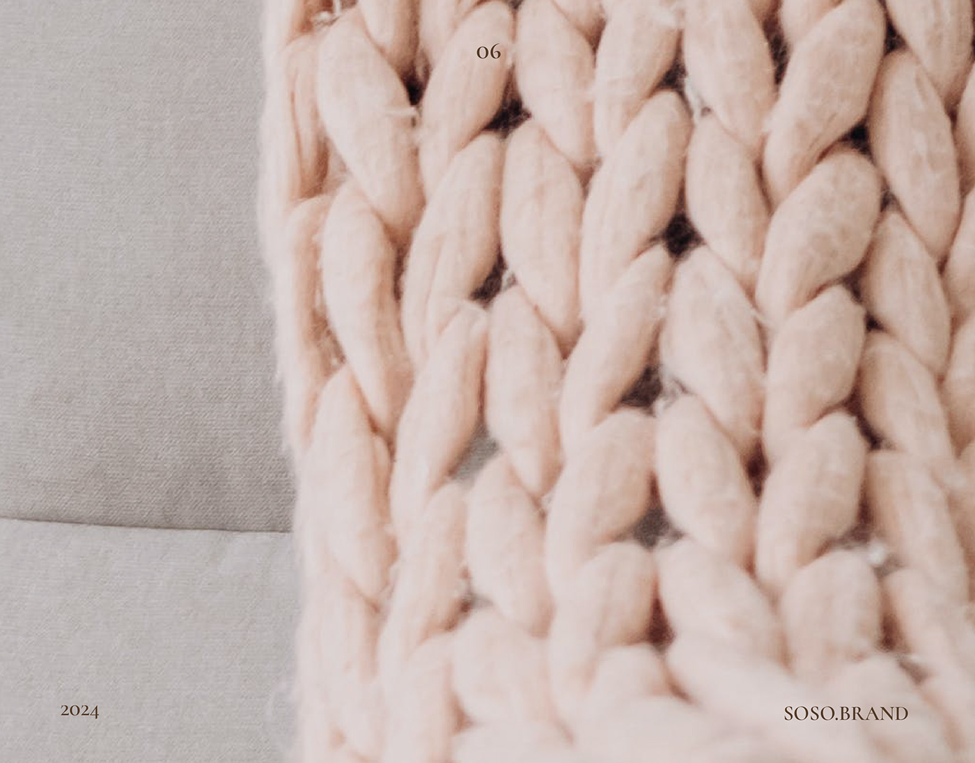
Основний продукт: жіночі сумочки та пледи. А отже основний посил це естетика,
витонченість та індивідуальність. " SOSO_BRAND" - це не лише бренд в'язаних сумочок, це спосіб життя,
який поєднує в собі тепло ручної роботи та сучасність моди.
Клієнтки: сучасні жінки, які цінують якість, унікальність та естетику.
Вони прагнуть виражати свою особистість через свій стиль та вибір аксесуарів.
В'язані сумочки від " SOSO_BRAND" - це не просто аксесуар,
а вираз індивідуальності та тепла рукоділля.
/ ENG /
SOSO_BRAND
Brand philosophy: the idea of reproducing the greatness and uniqueness of each product.
Each product is the result of a creative process in which each knot, each loop, each seam -
THIS IS A MANIFESTATION OF ATTENTION AND CARE FOR THE CUSTOMER.
Each product is the result of a creative process in which each knot, each loop, each seam -
THIS IS A MANIFESTATION OF ATTENTION AND CARE FOR THE CUSTOMER.
Main product: women's handbags and plaids. And therefore the main message is aesthetics,
sophistication and individuality. "SOSO_BRAND" is not only a brand of knitted handbags, it is a way of life,
which combines the warmth of handwork and the modernity of fashion.
sophistication and individuality. "SOSO_BRAND" is not only a brand of knitted handbags, it is a way of life,
which combines the warmth of handwork and the modernity of fashion.
Clientele: modern women who appreciate quality, uniqueness and aesthetics.
They strive to express their personality through their style and choice of accessories.
Knitted handbags from "SOSO_BRAND" are not just an accessory,
AND THE EXPRESSION OF INDIVIDUALITY AND THE WARMTH OF HANDICRAFT.
They strive to express their personality through their style and choice of accessories.
Knitted handbags from "SOSO_BRAND" are not just an accessory,
AND THE EXPRESSION OF INDIVIDUALITY AND THE WARMTH OF HANDICRAFT.


/ UA /
Ідея:
Оскільки засновниця і є виконавцем усіх замовлень, рішенням стало розвинути ідею особистого бренду.
Для знаку взято першу літеру назви "S", що воодночас і є першою літери імені засновниці. Літери утворюють переплетіння, що нагадує безкінечність. Шрифтова частина - витончений шрифт з засічками, графічною лінією та наголосом. Дискриптор - чіткий без засічок, щоб не відволікати увагу від знаку.
/ ENG /
IDEA:
Since the founder is the executor of all orders, the decision was to develop the idea of a personal brand.
The first letter of the name "S", which is also the first letter of the name of the founder, was taken for the sign. The letters form an interweaving that resembles infinity. The font part is an elegant font with serifs, graphic line and emphasis. The descriptor is clear without serifs so as not to distract from the sign.